The "Cathedral Church of the Blessed Virgin Mary of Lincoln" is a beautiful gothic building that towers high over the medieval part of the city. At the south side, the transept contains an archway which allows a framed view the two towers rising above the nave. In this photo story I like to share with you the picture I took from that position and how I processed it to the final image. I will try to explain how and why I manipulated the photo and of course this touches upon the question "How far can you go."
It is often believed that old fashioned "proper" photos present a "true" picture of the world but that modern post processing techniques using a computer make it possible to manipulate images so they no longer tell the truth. The fact is that picture manipulation is as old as pictures themselves, including photography. At the end it is down to the photographer to be truthful and not mislead their viewers.
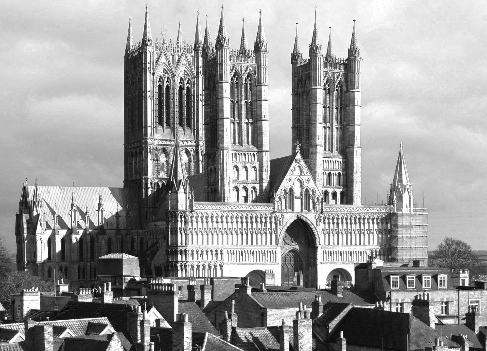
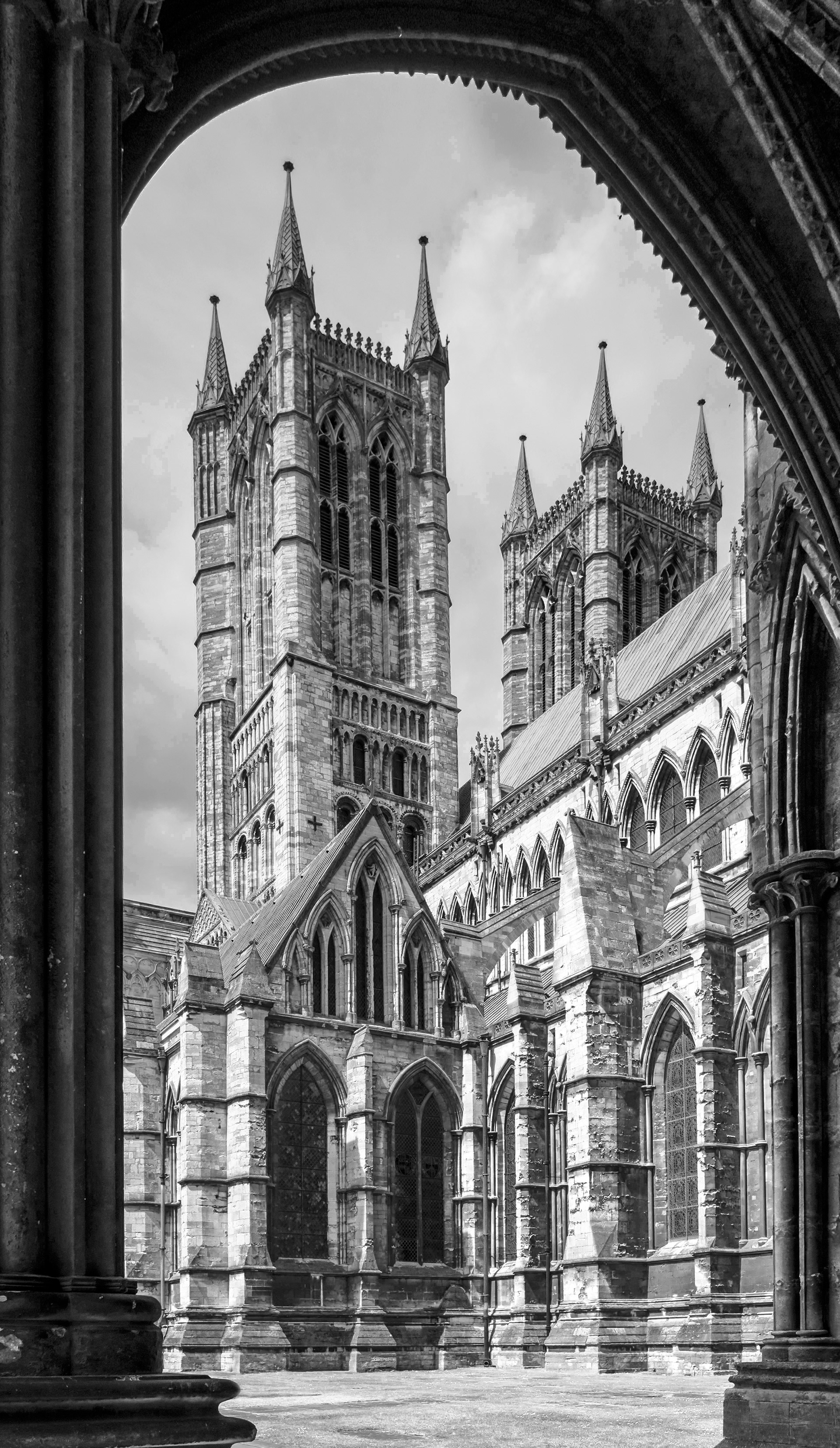
This is the photo of Lincoln Cathedral straight out of my camera.
Now this is not how I saw it when I took the picture. First of all the shadows did not look as dark. This is partly because our eyes are very good at constantly adjusting to light and dark areas in a scene. But the other reason is that I adjusted the exposure to properly show the details of the clouds and avoid the sky looking completely white. Most camera's will adjust the tonal range automatically so the picture looks more or less all right. But this is a matter of taste and I like to set my camera up so I can do this adjustment afterwards, exactly to my liking.
In the old dark room this was done by means of "dodging and burning". This involved holding something in the light bundle falling on the photographic paper to hold back (dodge) some light from specific areas of the picture or, conversely, allow some areas to receive a longer exposure. This could be done using just your hands or bits of cardboard of the right shape. The computer tools for this job are part of a far more powerful suite of local adjustment tools and are often still called dodge and burn.
The other "problem" is the converging verticals, making the building look as if it is falling backwards. Again, in the dark room this used to be fixed by tilting the negative and/or the photographic paper. To do it digitally involves extensive and complex calculations but in practice it's just a matter of adjusting a few sliders.
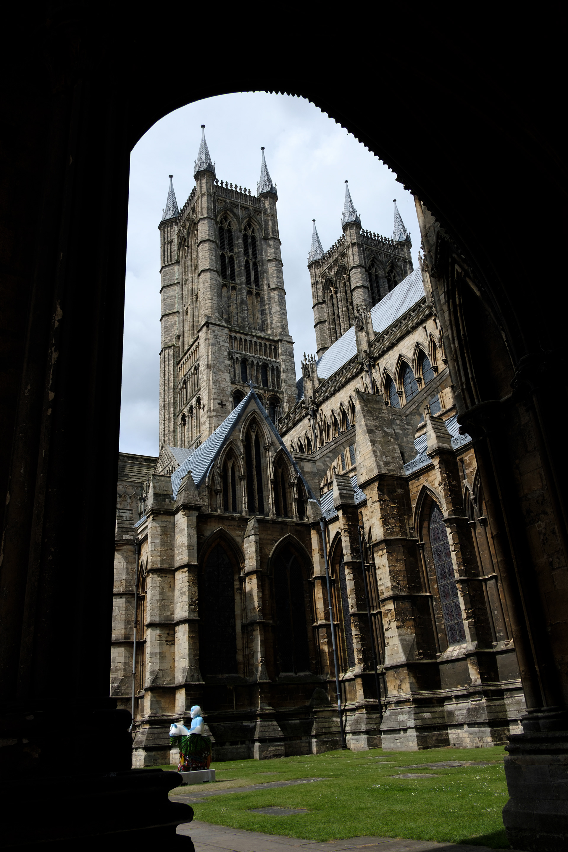
So with these two adjustments the picture starts to look like a proper photograph of the cathedral. The towers stand upright and you can see into the deep shadows while the sky still shows the detail in the clouds. Oh, and if you compare the two versions you may notice something else. In the summer of 2017 when I took this picture, Lincoln celebrated the 800th anniversary of the Battle of Lincoln by, amongst other things, creating a "Knight's Trail": 36 knights on horses dotted all over the city. Unfortunately, one of these had been placed on the lawn next to the cathedral, photo-bombing my shot.
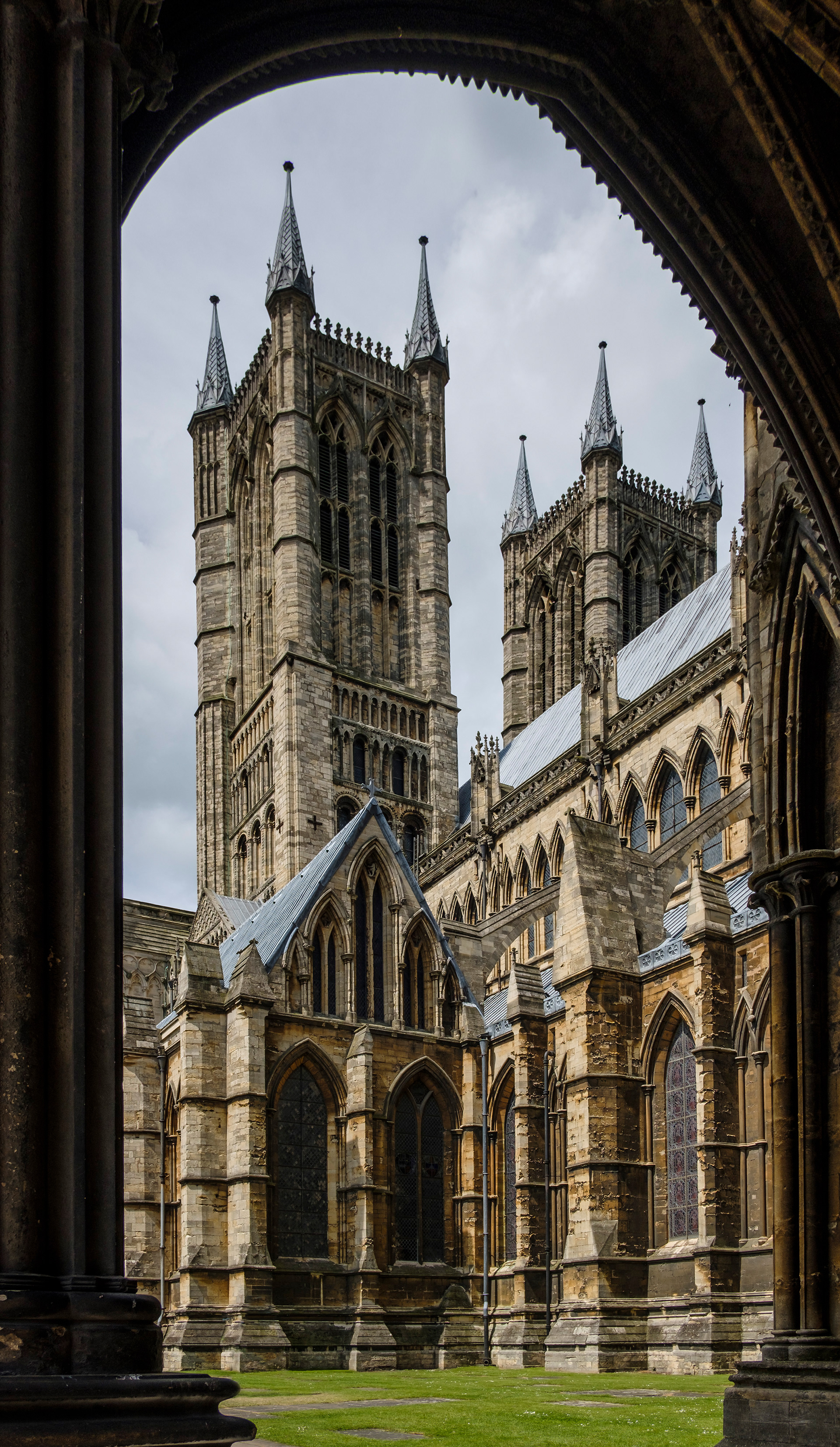
Now, again, photo retouching is nothing new. It used to be done, not in the dark room, but under a bright light with a magnifying glass, very fine brushes and lots and lots of skill and patience, often by specialist staff. Luckily the digital equivalent of healing and cloning is rather easier and much less time consuming. Anyone can do it in a few minutes. So no more bright blue knights in my photograph!
The photo now is more or less what, with the help of my clever eyes and my even cleverer brain, I saw on the day. But it was not what I saw in my mind.
If you have looked around this website it will come as no surprise that I like black and white photography. I find B&W particularly suited for most architectural shots.
Of course photography started off as a monochrome medium and at the time the prints were fully accepted as a true representation of the subject. But the desire to produce colour images was strong and the ingenuity to get there impressive. Initially, the results were called "Colour Photographs" to distinguish them from the standard black and white. Apart from showing a more realistic representation of the world, colour can be a powerful expressive component of an image. Still, it took to the second half of the twentieth century before colour was an implicit feature of a photograph and now we talk of "Black and White" photography to distinguish it from colour.
In some cases, however, colour does not really contribute to the message of the photo or, even worse, it can be a distraction. For instance the blue knight in the first version of the cathedral image stands out like a sore thumb. And the three colours in our image: the green of the grass, the sandstone of the building, and the light blue in the sky, do not really support the visual elements in the shot, which are mainly shapes and lines. So I decided to convert the picture to black and white to give a softer and more timeless atmosphere.
But I wasn't quite where I wanted to be yet. I took one further processing step and applied a treatment that provides a strong graphic representation, for me communicating the elegance and loftiness of the building in an optimal way. This is the final result:
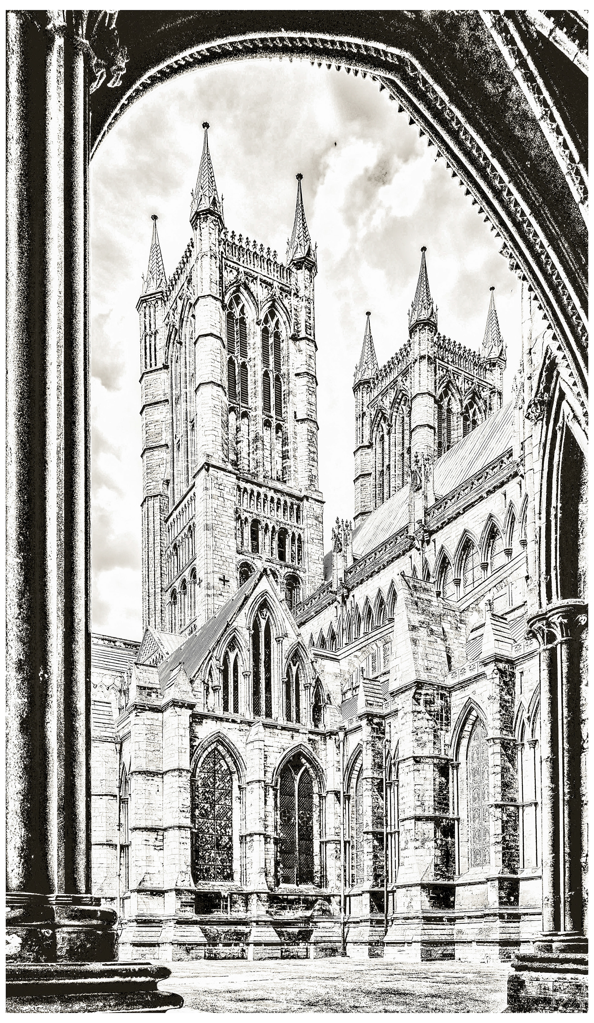
I showed this picture at the Annual Open Exhibition at the Gallery of the Leamington Studio Artists in Leamington Spa and I am proud to say the picture sold and now hangs on the wall in a house in Lincoln.
-o-