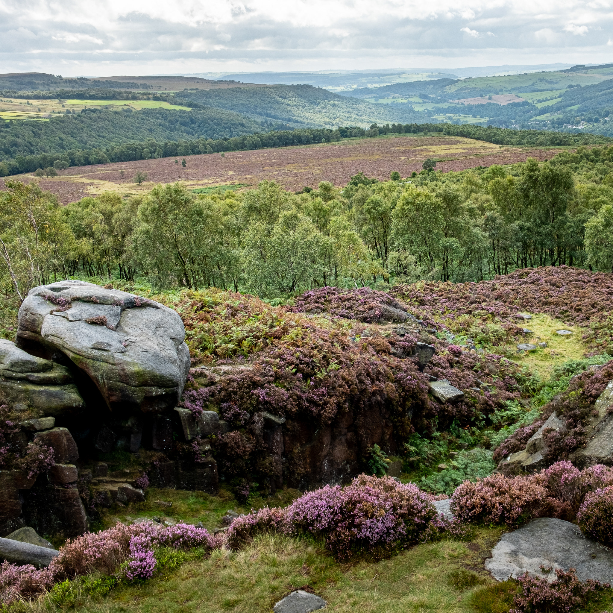
The Hidden Colours of Stone
In September, the Jaguar Photographic Society set a creative challenge on the theme of “Natural Abstracts”. Shortly afterwards, on a JPS trip to the Peak District, I took a few close-up photographs of some exposed rocks. The pictures looked faintly abstract but were rather bland. So I decided to jazz them up a bit by playing with the colours: my “Abstracted Colours” project was born.
The colours of objects are an essential factor in their recognition. If the colours are different from what we expect, we may not recognise the object; it becomes abstract. So colour manipulation is an important tool in the armoury of the abstract photographer. The literal meaning of “to abstract” is “to take away”, “to remove”. In Abstracted Colours, the basis of my approach is to take away some colour components (but maybe add a few as well). By removing some colours, new colours appear and the results can be quite striking.
For instance, when you remove blue from an image, the result is a strong yellow cast which won’t look very attractive. However, if you limit this to the lighter parts of the picture and add blue to the darker parts, then you will get a combination of complementary colours that can be very pleasing. This is of course the principle of colour grading that is widely used in cinematography and, increasingly so, in stills photography.

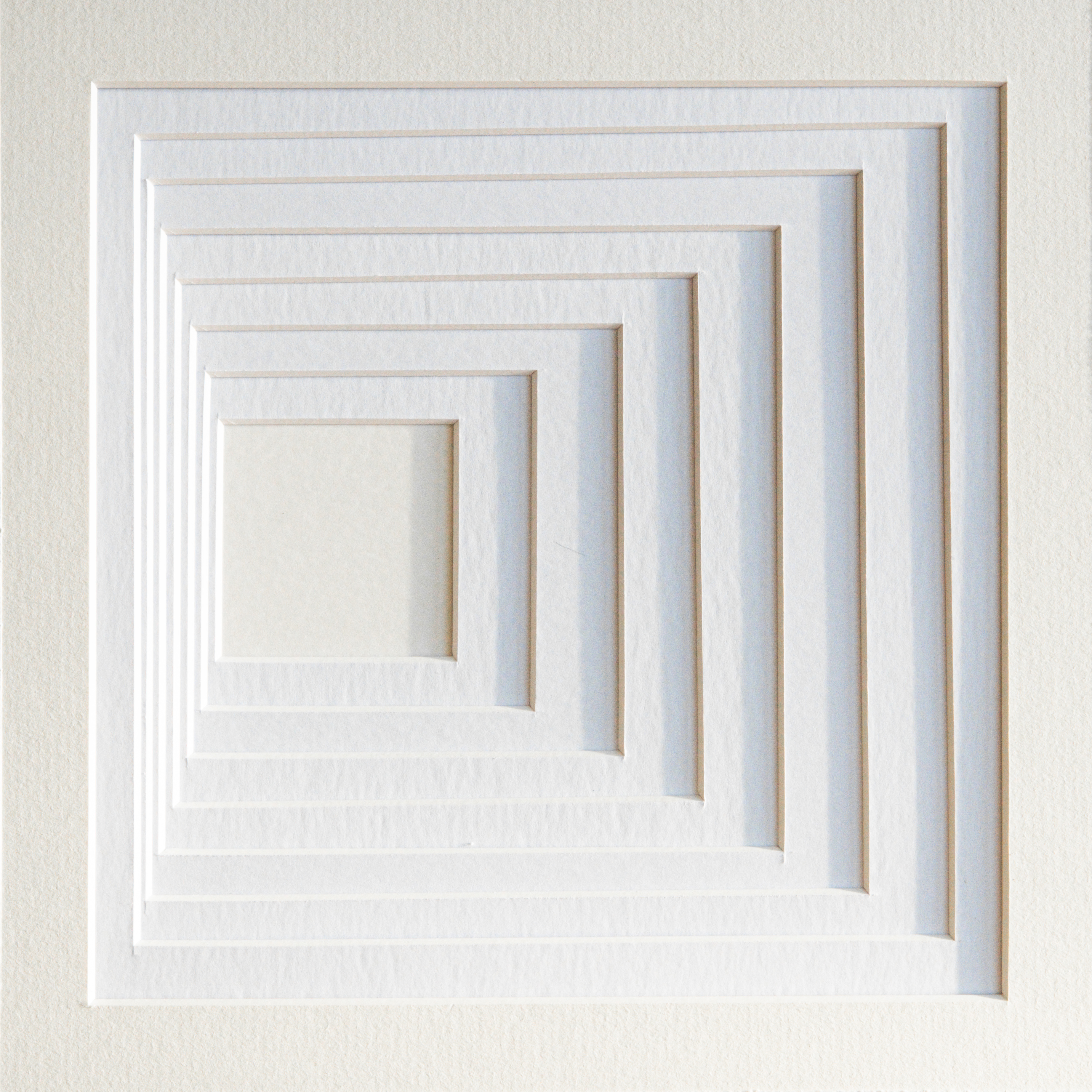
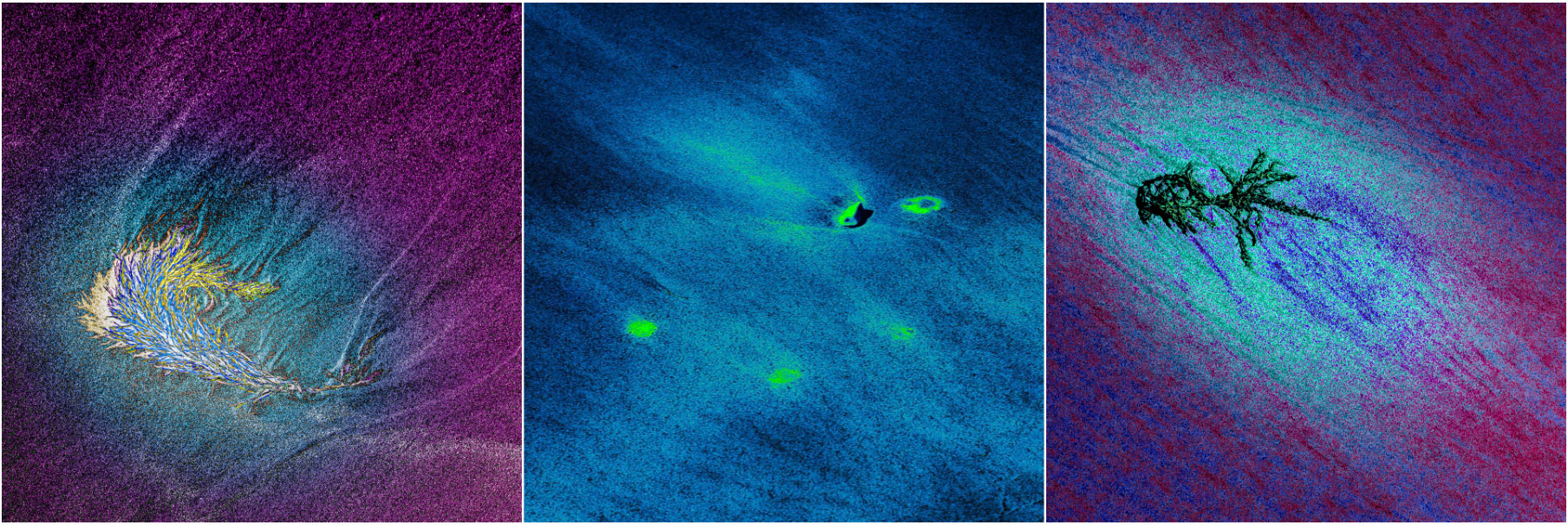
Memory of the Wind
Take this one step further: not only apply unexpected colours to the image, but also modify the relationships between light and dark away from what looks natural. E.g. if the highlights are made dark and the midtones bright, then the character of the image changes dramatically. The extreme example of this is of course a negative of the image: something weird looking but, to those who are still familiar with colour negative film, still recognisable. Without going that far, the use of tonal adjustment in a targeted way can produce an appealing level of abstraction.
In my Abstracted Colours project I apply these principles boldly, making individual adjustments to the reds, greens, and blues in the image, adjusting the lightness of different tones, adapt local contrast to emphasise or de-emphasise detail, and dodge or burn (i.e. lighten or darken) local areas. The patterns of colour that I create in this way give a new interpretation to the underlying subject of the image.
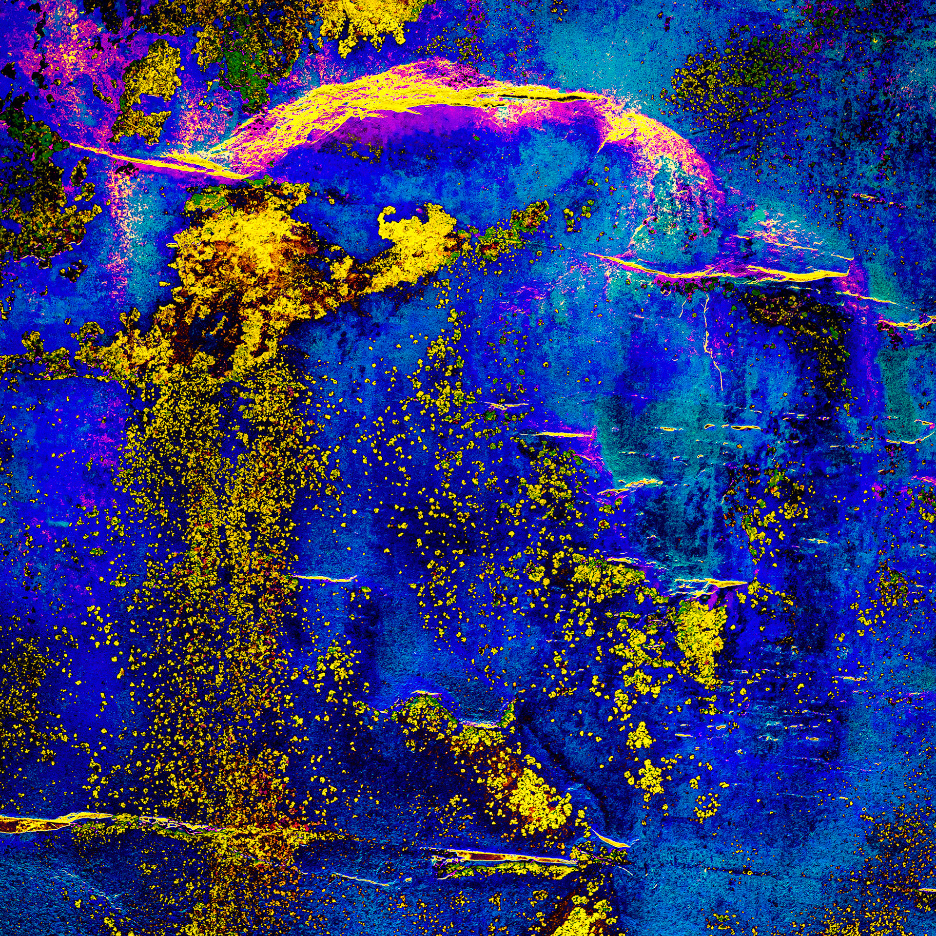
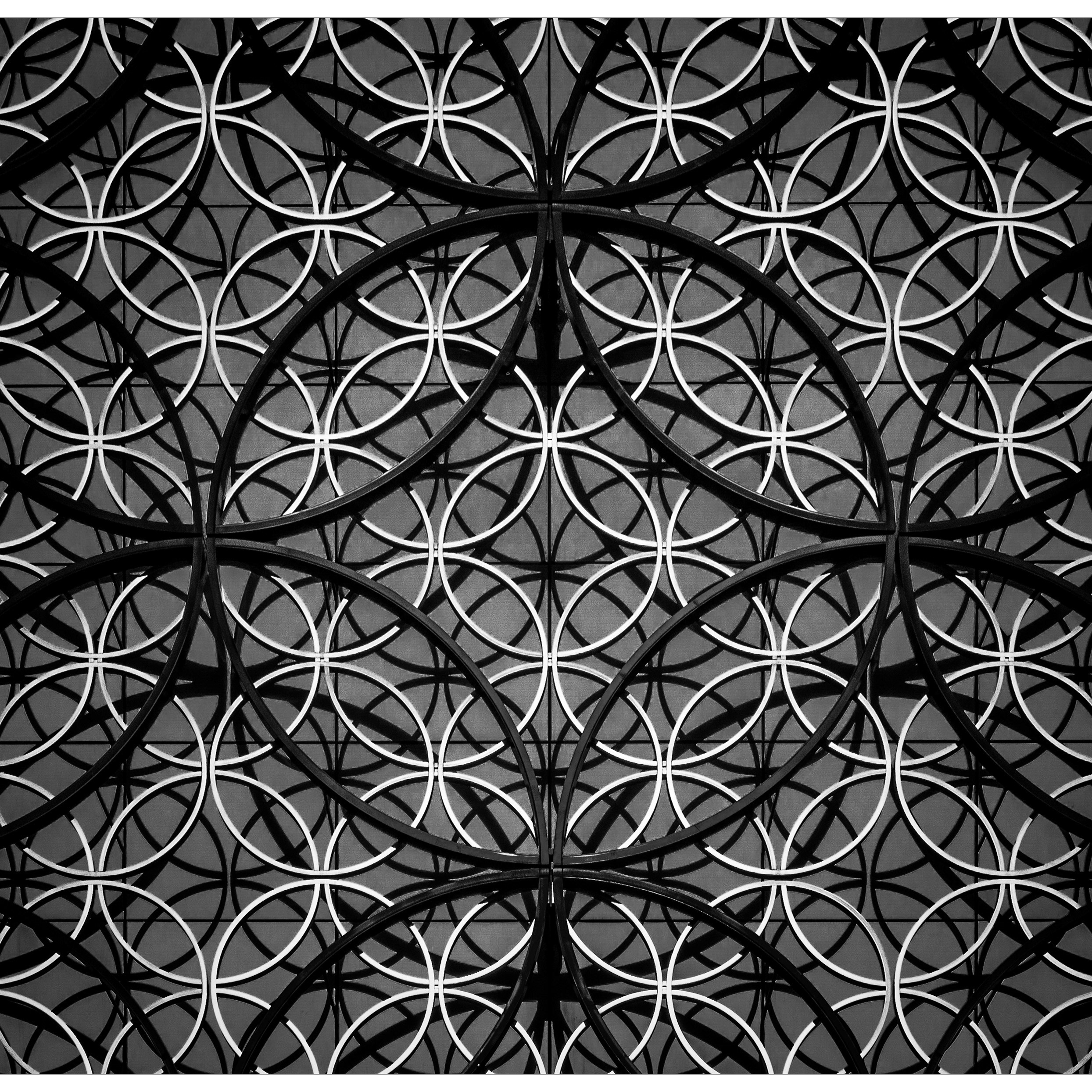
Oriental Gold
My initial experiments were more bewildering than focussed and many of my results were rather psychedelic. But I got some idea of the effects I could achieve and I learned rapidly what to do and what not to do. I also started to find out what sort of photos could form the canvas for producing Abstracted Colour Images. Armed with this experience I started looking intentionally for photographs that could work.
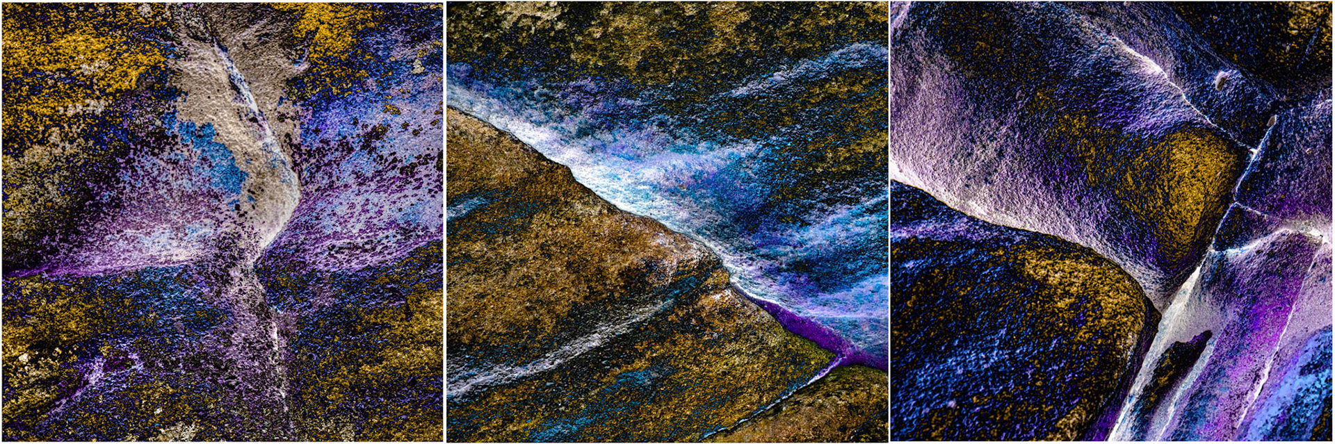
My first hunting ground was the beach at West Wittering where I spent happy hours photographing the sand straight in front of my feet. The unsuspecting passers-by probably thought I was off my rocker, except for one lady who came over to see the exotic wildlife she was convinced I was photographing. "Memory of the Wind" above and the triptych “Floating on Sand” below are from that expedition.
Floating on Sand
In this photo story I have shown abstract images and revealed what I photographed, thereby abstracting the abstraction. This is of course the wrong thing to do. When confronted with an abstract image, the question "What is it?" is irrelevant. "How does it strike you?" or simply "Do you like it?" is more to the point.
Since my day on the beach I have explored many other subjects and I am slowly building up a collection of new abstract images. If you want you can follow me on my dedicated instagram account @joostlohmandigitalart where I publish new pictures as I go along. And watch this space for a forthcoming new Photo Collection; I promise: I will not reveal what the images "are of".